Every artist or designer has a list of people who have influenced their work, and we're no exceptions to that.
We glean inspiration from all manner of sources, but in terms of form and "crispness" in our work, as well as the approach we take to concept-driven design, one of our strongest influences is
Josef Müller-Brockmann. Considered to be one of the key innovators in the Swiss School of International Style, he helped to establish a new era of clean, minimalist design aesthetics that were a total contrast to the heavily ornamented, subjective designs of the late 1800s/early 1900s.
If you've studied graphic design or typography, you're undoubtedly familiar with some of Müller-Brockmann's posters, in particular those that he did for concerts that took place around Switzerland:
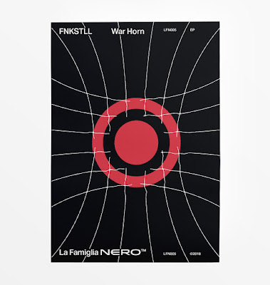
These posters display a geometric, mathematical harmony that's meant to reflect the rhythms and harmony present in music itself. Likely influenced by the graphic style of
Bauhaus poster design, these are a far cry from heavily illustrative pieces—they're pared down to their most essential elements, but still draw the eye and evoke a cerebral response from the viewer.
“The belief that graphic design—if it was to inform and enlighten
without being manipulative— had to be based on objective criteria,” is
what led JMB to his turning point."
His more angular pieces even evoke the sharp lines and bright hues of the
De Stijl movement (think
Piet Mondrian and
Vilmos Huszar), and he used typography as a key design element instead of relegating it to just convey written information.
In stark contrast to the over-decorative frippery of the earlier 1900s,
his pieces were minimalist, and utilised the key elements of visual
design, including hierarchy, balance, unity, gestalt, contrast, and
repetition. His use of typography was crisp and efficient, he leaned
towards 3- or 4-column layout, and often used typefaces from the
Akzidenz Grotesk family.
His work embodied functionality, objectivism, concrete art, legible typography, and adherence to the concept or theme of a project, rather than enforcing a personal style that could be easily recognised. He was a huge proponent of using grids and geometry in his work, and even wrote a book entitled
Grid Systems in Graphic Design, about his approach to/execution of various projects. One small excerpt from that book expresses a great deal about how we approach design, whether it's a logo or an entire visual identity system:
This is the expression of a professional ethos: the designer’s work
should have the clearly intelligible, objective, functional and
aesthetic quality of mathematical thinking.
His work should thus be a contribution to general culture and itself form part of it.
Working with the grid system means submitting to laws of universal validity. The use of the grid system implies:
The will to systemize, to clarify
The will to penetrate to the essentials; to concentrate the will to cultivate objectivity instead of subjectivity
The will to rationalize the creative and technical production processes
The will to integrate elements of colour, form, and material
The will to achieve architectural dominion over surface and space
The will to adopt a positive, forward-looking attitude
The recognition of the importance of education, and the effect of work devised in a constructive and creative spirit.
Every visual creative work is a manifestation of the character of the designer. It is a reflection of his knowledge, his ability, and his mentality.
Although we draw a great deal of inspiration from Müller-Brockmann's work, it's his emphasis on drawing from the brief and placing all focus on making the project shine, rather than creating something based on his own whims and fancies, that inspires us the most.
Advert poster for a Swiss car club, with a strong warning to watch out for/protect children.
Müller-Brockmann was able to say more in his restraint than many designers can express in all of their subjective doodles combined. Simplicity of form, elegance, and a noted lack of ornamentation resulted in pieces that spoke softly, but with a strong, powerful voice.