Showing posts with label modernism. Show all posts

Thursday, February 14, 2019

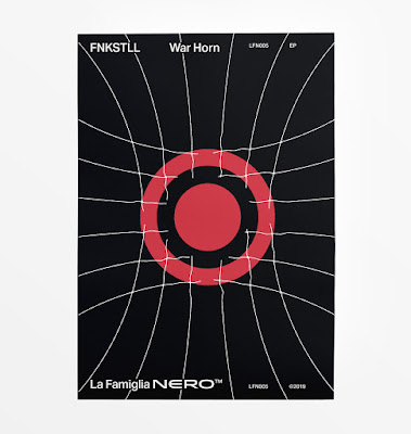
War Horn—album cover design process


Album cover designs always seem easier to execute in one's head—when it comes to practise however, things aren't so simple. Here's a quick peek at design work done recently for War Horn by FNKSTLL, an upcoming release through the techno label, La Famiglia Nero.


The visual language that defines La Famiglia Nero's identity tends to stray on the side of Modernism, with carefully considered placement, sans serif typefaces and an underlying grid structure to unify the various releases. Previous designs have explored flat, geometric compositions using an economy of means and exercising restraint in execution.

For the album cover, I started my visual explorations on paper, since I can thumbnail ideas quickly before taking them into Illustrator. I wanted to visually convey the power of a war horn's blast, and after some doodles, I liked how the expanding concentric circles were looking. However, I was feeling it was a bit cliche once I started recreating the designs in the computer.


If I'm ever stuck, I find a solution for creating unique designs is to ask, "How can I communicate this concept differently?" By rattling and opening new doors, you'll be surprised at some of the novel solutions you may discover on the other side.


One option I explored had radiating lines emanating from a central red disc—a simplification of the the front of the horn. The lines imparted a sort of tribal feeling and I like the optical shimmer effect that happened as the thickness tapered towards the center of the composition.


Pushing the idea further, I created a sense of depth and weight as the round red pulse struggled to break free from a radar grid of thin lines. I like the contrast between weights and colours, and how the net bled off the page breaking the borders.


Here's a peek at the final render of the "War Horn" album cover which comes out later this month, as well as how I adapted the designs for the poster and banners. The tracks on the EP are a body-moving exercise in murky, paired down techno which hopefully the designs do justice!


Tuesday, September 19, 2017

Embracing the local colour


In the past, design was flavored by geographical isolation. Aesthetics were informed by the characteristics of the landscapes that people saw on a daily basis, whether sharp mountain peaks, or soft, rolling foothills. Hues from the landscape informed designers' palettes, and all of these factors made it easy to discern design that originated in Germany versus England. With the birth of the International Typographic Style in the 1960s, such clear delineations ended up muddled: influences were taken from around the globe, rather than being cultivated in a bubble.


A question that came to mind recently was this: in these modern, connected times, with endless scroll feeds informing an international aesthetic, what role does local culture play in a design practice?

We live in an isolated forest community in rural Quebec, tethered to the world at large thanks to the miracle of the Internet. As part of our creative process, we study our surroundings, drawing colour swatches and composition ideas from nature. It’s interesting to note that everything we see around us exists because their ancestors were successful when it came to adaptation and reproduction.


Flowers in particular have adapted over countless generations: the colours that we see are the most fit;, the tested and true that have found equilibrium after eons of attracting and dancing with pollinators.


The colour combinations and scintillating contrasts that exist naturally are there for the taking, so we have begun to use them, with reverence. In fact, we have recently undertaken some constraints in our personal design practice: within our process, we are only allowed to drawn upon the palettes that we've "unlocked" locally.


There is something rewarding about having to physically traipse through the forest on a colour safari, hoping to stumble across some new bit of fauna that will expand our palette. Factors such as the time of day and the camera we're using end up playing a role with regard to the hues being documented as well. Our intention is to represent truth in as objective a manner as possible, and reflect nature's sage counsel when it comes to colours.


In this manner, our work becomes informed by the local environment, with inspiration pipelined and swatched direct from Mother Nature herself. In some manners, we're plagiarizing her greatest works ruthlessly, but the act of being an imperfect conduit for her inspiration becomes an act of creativity: the noise on the line.


When shared back to the connected design community, our work can't help but reflect the environment we're living in, with colours and shapes native to the ancient forest that surrounds us.


You don't have to hightail it to the desert like a nomad to get inspiration (though thinking about it, doing so sure sounds pretty). Your neighbourhood's architecture and charm are real expressions of humans bringing order and joy to their environment. That impulse right there is pretty much the definition of design, so if you take what you observe around you and reflect it into your work, you can achieve that objective posture that so many Modernists sought: moving the ego aside, you can submit to the universe and become a perfect conduit to natural Order and Truth.

Thursday, December 1, 2016

Tuesday, February 9, 2016

New Year, New Look


Since 2016 marks Winter-Hébert's 5th anniversary, the time is right for us to update our visual identity. After much brainstorming and sketching and fussing and such, we decided to go with simple forms and basic hues, inspired by the birds that helped to spark our studio's very existence.


Many people are unaware of the fact that our studio came into being thanks to a couple of house sparrows. Back in 2011, we were both working with various studios in the Toronto area when we found a tiny, newly hatched baby bird squirming on the hot sidewalk outside a store. Being the animal lovers that we are, we promptly scooped him up and took him home, hoping that we could somehow keep this little weirdo alive. His need for around-the-clock feedings prompted us to start working remotely with commissioners from around the world, and that leap was reaffirmed by our finding a female hatchling not long afterwards. 

We named them Robin and Puck*, and they turned out to be a couple of house sparrows (Passer domesticus). Robin had been tossed from his nest because of physical deformities, while Puck was the only survivor of a nest destruction by a nasty neighbour. Since neither of them would have survived out in the wild, they've become our constant companions and travelled with us from Toronto to our current place in rural Quebec.
These two little birds weren’t just the catalysts for us establishing our own design studiothey reflect the duality of how we approach our work as a whole. Just like our sparrows live (and play) together, with their unique personalities contrasting and complementing one another’s, so do we tread the magical middle zone between rationally driven design and intuitive solutions. 


For the revamp, we chose a simple white and blue palette, with an elegant sans serif typeface and simplified lines. The white represents Winter (as well as my Scandinavian ancestry), and the classic French blue pays homage to Nathaniel's French-Canadian lineage (the Héberts have been living in Quebec for over 400 years).

We think that this new look encompasses our fondness for sleek, modernist design, as well as our passion for authenticity and handmade craft. Our work is heavily influenced by Dutch and Swiss work, but we will hand-draw unique typefaces if the occasion calls for it, and we’ve incorporated elements such as watercolour painting, embroidery, and even wood burning into projects. 


We think that our new look says a great deal about who we are, and we hope you like it as much as we do.

Puck and Robin in all their adorable glory.

*Sparrows' plumage becomes identifiably male or female after their first moult, so we chose gender neutral names for our feathered kids so they'd fit well regardless of whether they turned out to be male or female.
Also, just for the record, their names were chosen from Shakespeare's Midsummer Night's Dream, not hockey.