Showing posts with label vintage. Show all posts

Wednesday, August 2, 2017

Farm the World Visual Identity

Farm the World is an endeavour geared towards teaching people how to grow their own food and medicinal plants in whatever space they have available to them, anywhere in the world. The site hosts articles about growing techniques, tips about heirloom and organic seeds, recipes, and herbal medicine-making tutorials, and offers products such as apparel, bags, and even art prints to help fund both the site, and its future seed box subscription program.

As the endeavour was inspired by both the Great Depression era and WWII "victory gardens", we created a visual identity drawn from rustic, vintage images and typefaces. The typography was actually based on rural signage, like the lettering found on milk crates and farm equipment.
 Colour inspiration was drawn from nature photos (a tomato held against the sky, leafy greens juxtaposed against compost-rich soil), with an overall aesthetic that speaks of wholesome self reliance and healthy foods.


For the botanical bags, we used vintage illustrations to evoke the imagery used on seed packets from the 1930s.


 There's also a series of bags, art prints, T-shirts, tanks, and hoodies that are solely typographic (on FTW colours), and use the typeface featured in the logo and website header.


All art prints and apparel are available via Farm the World's Society6 page.


FarmtheWorld.org


Wednesday, January 13, 2016

La Boulangerie Nouvelle France


One of the greatest joys we have as designers is when we have the opportunity to create work for our own community. There’s something very special about receiving a printed newsletter in the mail that we designed, or seeing signs that we created for small businesses when we walk down the street. The latter is what we’re focusing on today, as we had the pleasure of re-branding our village bakery recently, and it’s one of our favourite projects from 2015.


The Boulangerie Nouvelle France (The New France bakery in English) sits at the very edge of our village, and is renowned throughout the area for its fabulous breads and pastries.

The bakery owner, Marie-France, quit her job in the city and moved out here to pursue her dream, so its name is a bit of a play on words: not only was Quebec known as "Nouvelle France" for quite some time, but the shop is a new beginning for the baker herself.

We had to adhere to some pretty tight constraints for the project: the signage needed to be easily readable from the street, as it’s a major roadway that people drive through quite quickly—it needed to be recognizable as a bakery shop in a single glance. As such, we used the silhouette of a loaf of bread and a rolling pin as iconography along with a very legible typeface for "boulangerie". Size-wise, the sign had to adhere to the dimensions allowed by the village council, and aesthetically, it needed to capture the rustic charm of rural Quebec life.


The overall aesthetic direction we chose is a French Country "shabby chic" look, inspired by the fact that the building itself is over a century old. Just like this design style is characterized by mismatched furniture pieces when it comes to interior design, we mixed and matched sans serif typefaces, which is a technique we’d normally frown upon.

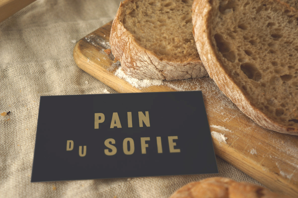
With regard to our colour choices, we drew our inspiration from the bakery’s famous pain au chocolat (chocolate croissant). We used the dark brown of its chocolatey interior, the pale cream of the interior pastry, and gold accents to mirror the flaky crust.


The shop’s interior is currently being redecorated with the new colours, so hopefully we’ll be able to share photos of the new bakery in its entirety soon! In the meantime, we get to smile every time we pass by the shop and see our design work in action.


Friday, May 29, 2015

Swag for a Gothic Fashion Tea Party

Our lovely friend Taeden is the creatrix behind Gloomth and the Cult of Melancholy—a gothic fashion and lifestyle line based in Toronto, Ontario. Gloomth is holding their first-ever public tea party on June 13th, and we were invited to contribute an item to their coveted charity raffle prize pack.  (All proceeds from the raffle will benefit the Toronto Wildlife Centre.)


We donated a tote bag from our Sparrowling Press/Provincial Trading Company line of eclectic ephemera inspired by Victorian design and all things weird and wondrous. The Economical Mourning bag was beautifully described by Taeden as: "...the ideal tote for when you are out shopping for more embalming fluid". High praise indeed, thank you!


If you'll be in the Toronto area on June 13th and have a fondness for all things Lollygoth, stop by the Flying Pony Cafe at 1481 Gerrard St. East between 6:30 and 10:30 pm. Admission is free, and there will be a gothy dress code enforced, so no jeans or Birkenstocks!