Showing posts with label graphic design. Show all posts

Thursday, April 6, 2017

Sugar and Pith


We were approached to update the visual identity for a California-based, small-batch apothecary company called Sugar and Pith, and it was a complete delight to delve into the aesthetic they were looking for.

The client was hoping for an Art Nouveau type of look without too much fussiness, and since the items she creates are based on seasonal ingredients, the identity system needed to be such that she could create her own labels as needed.

The answer to that was to use a warm, hand-lettered typeface with Art Nouveau-inspired botanical ornamentation.

 Larisch is a hand-lettered design by the Austrian calligrapher and teacher, Rudolf von Larisch. The original was used for the title page of the 1903 edition of Beispiele Kunstlerischer Schrift (Examples of Artistic Writing). The typeface has an attractive, casual set of caps of even strokes with rounded terminals. Except for the terminals, it is similar in style to Kunstler Grotesk.

The designer (Larisch) taught lettering at Kunstgewerbescule (School of the Commercial Arts) and Akademie der Bildenden Kunste (Academy for Visual Arts), both in Vienna, and the care and craft he put into his work is evident in the type's warmth and humanity.


Aren't these labels sweet? We were lucky enough to get some samples of the products themselves and they really are fabulous.


Sugar and Pith display at a local farmer's market.


Wednesday, August 31, 2016

TWIST 2016 - 5th Anniversary!


This year marked the 5th anniversary of the TWIST festival, and it was a blast to be part of the team that helped to bring it to life! The identity we created for this year's event was the brightest and most exciting yet, so if you weren't able to attend in person, scroll through festival's photos below to see what you missed!


Monday, July 18, 2016

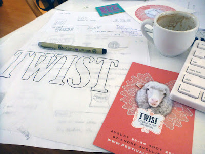
Case Study: TWIST Logo Redesign


It's fun to look back at projects to see how they have evolved over time.

We don't often have the opportunity to cultivate a visual identity over the course of a few years: normally we work with commissioners for a few months to sort out their needs and then hand over the branding we've created for them. As the graphic designers for the TWIST fibre festival, however, we've been able to guide its evolution over the past 3 years.

This is what the TWIST logo looked like when we were brought aboard to audit their brand:


The intention behind the design was to create something that looked handcrafted and fun, as well as contemporary.
Their original designer had chosen a free font that only used repeating characters, and that repetition drew away from the handcrafted, authentic aesthetic that was being aimed for. Additionally, the typeface had a faux cross-hatched effect on it and there were some issues with the logoform's letter spacing.

One major problam with this version of the logo was that it was difficult to implement in different situations, and the tagline would disappear entirely if we tried to shrink it down to a usable size. We fixed that.
A strong brand guideline hadn't been established previously, so we cultivated one for them. We chose typefaces and colours, and defined their visual language.

This was last year's look:


We really wanted to emphasize the essence of handmade craft, so we drew a "Clarendon-esque" typeface by hand, imported it into Adobe Illustrator, and adjusted the letters by eye until the spacing was more optically balanced.
By creating a one-of-a-kind, truly hand-drawn typeface, one elevates brand equity because that typeface isn't one that can be downloaded on any font website.
TWIST has a different theme every year, and the visual identity can be refreshed accordingly in order to reflect each year's energy and aesthetic. This year has a particularly exciting energy because it's the festival's 5th anniversary, so our goal was to embody that by creating something vibrant and colourful; something that reflected the fact that this is a celebration of fibres and the myriad ways that people transform them.

As such, we went for a very hands-on approach: since I have been engaged in all manner of needlecraft since childhood, I went through my yarn stash and embroidered the logo by hand.


The letters were embroidered in a variety of different stitch styles so we could pick and choose among them to create the most dynamic effect. We went for bold, saturated hues this year both to evoke the aforementioned celebratory theme, and to promote the idea that this is a festival for all ages and genders to enjoy.


Our hope was that attendees and aficionados could be inspired by what we've done and make TWIST their own: whether they're knitters, weavers, lace-makers, or embroiderers, we've invited them to be more active participants in the festival by creating their own ...twist... on the TWIST logo. 

...and Ava was a big help too.


Wednesday, March 30, 2016

... and got the T-Shirt!

Spring has sprung, and T-shirt weather is just around the corner. We have the privilege of designing a lot of fun items for our clients, but some of our favourite recent work has been for Paradise City's T-shirt collection.

Not all of these styles are currently available (some will come out for next season's autumn/winter collection), but they're all a hell of a lot of fun. It's great to be able to wear pieces that we've helped to create, especially when they're this awesome. ;)


Friday, May 29, 2015

Swag for a Gothic Fashion Tea Party

Our lovely friend Taeden is the creatrix behind Gloomth and the Cult of Melancholy—a gothic fashion and lifestyle line based in Toronto, Ontario. Gloomth is holding their first-ever public tea party on June 13th, and we were invited to contribute an item to their coveted charity raffle prize pack.  (All proceeds from the raffle will benefit the Toronto Wildlife Centre.)


We donated a tote bag from our Sparrowling Press/Provincial Trading Company line of eclectic ephemera inspired by Victorian design and all things weird and wondrous. The Economical Mourning bag was beautifully described by Taeden as: "...the ideal tote for when you are out shopping for more embalming fluid". High praise indeed, thank you!


If you'll be in the Toronto area on June 13th and have a fondness for all things Lollygoth, stop by the Flying Pony Cafe at 1481 Gerrard St. East between 6:30 and 10:30 pm. Admission is free, and there will be a gothy dress code enforced, so no jeans or Birkenstocks!