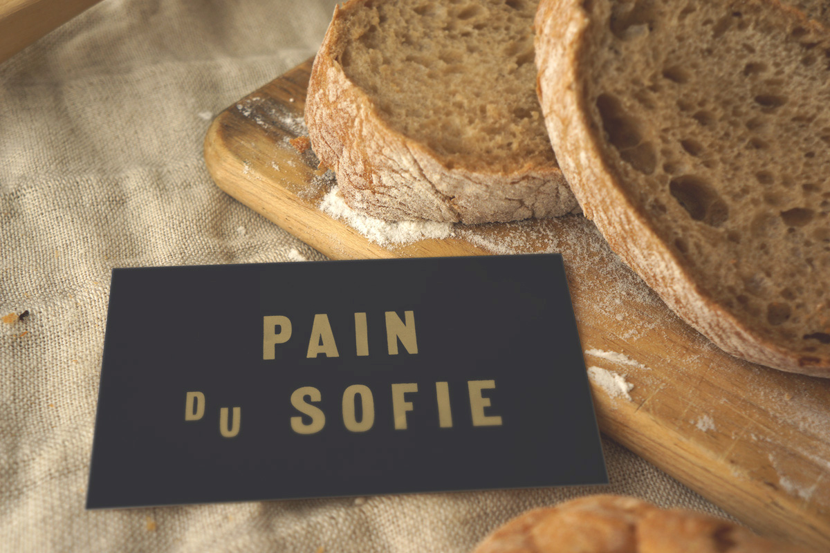
One of the greatest joys we have as designers is when we have the opportunity to create work for our own community. There’s something very special about receiving a printed newsletter in the mail that we designed, or seeing signs that we created for small businesses when we walk down the street. The latter is what we’re focusing on today, as we had the pleasure of re-branding our village bakery recently, and it’s one of our favourite projects from 2015.
The Boulangerie Nouvelle France (The New France bakery in English) sits at the very edge of our village, and is renowned throughout the area for its fabulous breads and pastries.
The bakery owner, Marie-France, quit her job in the city and moved out here to pursue her dream, so its name is a bit of a play on words: not only was Quebec known as "Nouvelle France" for quite some time, but the shop is a new beginning for the baker herself.
We had to adhere to some pretty tight constraints for the project: the signage needed to be easily readable from the street, as it’s a major roadway that people drive through quite quickly—it needed to be recognizable as a bakery shop in a single glance. As such, we used the silhouette of a loaf of bread and a rolling pin as iconography along with a very legible typeface for "boulangerie". Size-wise, the sign had to adhere to the dimensions allowed by the village council, and aesthetically, it needed to capture the rustic charm of rural Quebec life.
The overall aesthetic direction we chose is a French Country "shabby chic" look, inspired by the fact that the building itself is over a century old. Just like this design style is characterized by mismatched furniture pieces when it comes to interior design, we mixed and matched sans serif typefaces, which is a technique we’d normally frown upon.
With regard to our colour choices, we drew our inspiration from the bakery’s famous
pain au chocolat (chocolate croissant). We used the dark brown of its chocolatey interior, the pale cream of the interior pastry, and gold accents to mirror the flaky crust.
The shop’s interior is currently being redecorated with the new colours, so hopefully we’ll be able to share photos of the new bakery in its entirety soon! In the meantime, we get to smile every time we pass by the shop and see our design work in action.