Showing posts with label branding. Show all posts

Thursday, January 31, 2019

The Road to Neozon


It's always nice to see designs we crafted making their way around the world.


Anna Tambour's collection of short stories, The Road to Neozon is the type of narrative that throws you into danger, but then saves you like Doctor Who. A highly recommended read, and it was a pleasure to put together for Obsidian Sky Books. Speaking of the Detroit-based publisher, we also crafted their visual identity, as well as filling the book up with lush interior designs.


Check out The Road to Neozon by Anna Tambour:


Wednesday, August 2, 2017

Farm the World Visual Identity

Farm the World is an endeavour geared towards teaching people how to grow their own food and medicinal plants in whatever space they have available to them, anywhere in the world. The site hosts articles about growing techniques, tips about heirloom and organic seeds, recipes, and herbal medicine-making tutorials, and offers products such as apparel, bags, and even art prints to help fund both the site, and its future seed box subscription program.

As the endeavour was inspired by both the Great Depression era and WWII "victory gardens", we created a visual identity drawn from rustic, vintage images and typefaces. The typography was actually based on rural signage, like the lettering found on milk crates and farm equipment.
 Colour inspiration was drawn from nature photos (a tomato held against the sky, leafy greens juxtaposed against compost-rich soil), with an overall aesthetic that speaks of wholesome self reliance and healthy foods.


For the botanical bags, we used vintage illustrations to evoke the imagery used on seed packets from the 1930s.


 There's also a series of bags, art prints, T-shirts, tanks, and hoodies that are solely typographic (on FTW colours), and use the typeface featured in the logo and website header.


All art prints and apparel are available via Farm the World's Society6 page.


FarmtheWorld.org


Thursday, April 6, 2017

Sugar and Pith


We were approached to update the visual identity for a California-based, small-batch apothecary company called Sugar and Pith, and it was a complete delight to delve into the aesthetic they were looking for.

The client was hoping for an Art Nouveau type of look without too much fussiness, and since the items she creates are based on seasonal ingredients, the identity system needed to be such that she could create her own labels as needed.

The answer to that was to use a warm, hand-lettered typeface with Art Nouveau-inspired botanical ornamentation.

 Larisch is a hand-lettered design by the Austrian calligrapher and teacher, Rudolf von Larisch. The original was used for the title page of the 1903 edition of Beispiele Kunstlerischer Schrift (Examples of Artistic Writing). The typeface has an attractive, casual set of caps of even strokes with rounded terminals. Except for the terminals, it is similar in style to Kunstler Grotesk.

The designer (Larisch) taught lettering at Kunstgewerbescule (School of the Commercial Arts) and Akademie der Bildenden Kunste (Academy for Visual Arts), both in Vienna, and the care and craft he put into his work is evident in the type's warmth and humanity.


Aren't these labels sweet? We were lucky enough to get some samples of the products themselves and they really are fabulous.


Sugar and Pith display at a local farmer's market.


Wednesday, August 31, 2016

TWIST 2016 - 5th Anniversary!


This year marked the 5th anniversary of the TWIST festival, and it was a blast to be part of the team that helped to bring it to life! The identity we created for this year's event was the brightest and most exciting yet, so if you weren't able to attend in person, scroll through festival's photos below to see what you missed!


Monday, July 18, 2016

Case Study: TWIST Logo Redesign

It's fun to look back at projects to see how they have evolved over time.

We don't often have the opportunity to cultivate a visual identity over the course of a few years: normally we work with commissioners for a few months to sort out their needs and then hand over the branding we've created for them. As the graphic designers for the TWIST fibre festival, however, we've been able to guide its evolution over the past 3 years.

This is what the TWIST logo looked like when we were brought aboard to audit their brand:


The intention behind the design was to create something that looked handcrafted and fun, as well as contemporary.
Their original designer had chosen a free font that only used repeating characters, and that repetition drew away from the handcrafted, authentic aesthetic that was being aimed for. Additionally, the typeface had a faux cross-hatched effect on it and there were some issues with the logoform's letter spacing.

One major problam with this version of the logo was that it was difficult to implement in different situations, and the tagline would disappear entirely if we tried to shrink it down to a usable size. We fixed that.
A strong brand guideline hadn't been established previously, so we cultivated one for them. We chose typefaces and colours, and defined their visual language.

This was last year's look:


We really wanted to emphasize the essence of handmade craft, so we drew a "Clarendon-esque" typeface by hand, imported it into Adobe Illustrator, and adjusted the letters by eye until the spacing was more optically balanced.
By creating a one-of-a-kind, truly hand-drawn typeface, one elevates brand equity because that typeface isn't one that can be downloaded on any font website.
TWIST has a different theme every year, and the visual identity can be refreshed accordingly in order to reflect each year's energy and aesthetic. This year has a particularly exciting energy because it's the festival's 5th anniversary, so our goal was to embody that by creating something vibrant and colourful; something that reflected the fact that this is a celebration of fibres and the myriad ways that people transform them.

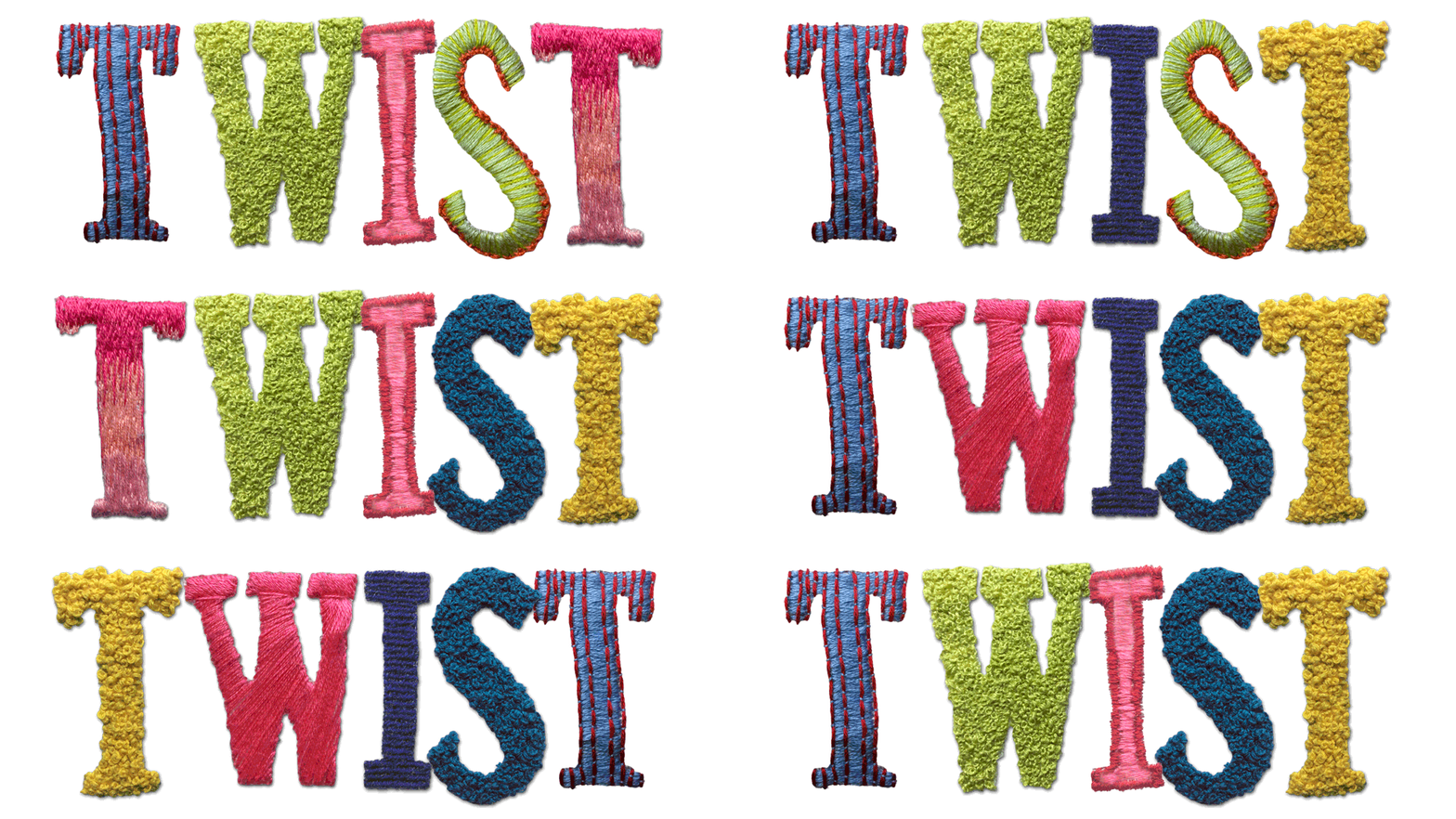
As such, we went for a very hands-on approach: since I have been engaged in all manner of needlecraft since childhood, I went through my yarn stash and embroidered the logo by hand.


The letters were embroidered in a variety of different stitch styles so we could pick and choose among them to create the most dynamic effect. We went for bold, saturated hues this year both to evoke the aforementioned celebratory theme, and to promote the idea that this is a festival for all ages and genders to enjoy.


Our hope was that attendees and aficionados could be inspired by what we've done and make TWIST their own: whether they're knitters, weavers, lace-makers, or embroiderers, we've invited them to be more active participants in the festival by creating their own ...twist... on the TWIST logo. 

...and Ava was a big help too.


Friday, February 26, 2016

Yoga Studio Cards


It's always a pleasure to work with local clients (like the Boulangerie we helped to re-brand), and we had the opportunity to create some business cards for another wonderful voisine recently.

Cynthia McCart is a a yoga instructor and massage therapist who lives and works in Saint-Andre Avellin. When it comes to design, she leans towards soft, pastel colours and images that evoke the serenity that she aims for with her clientele.


We placed a mandala with a pink/peach/coral gradient on a pure white background, and used gold type to complement the warm hues. Although the hue looks flat in the rendered images, the printing house was instructed to use gold foil, and the result is just gorgeous. Adding a little bit of shimmer to the cards gave them a bit more personality than if they'd be printed in flat tones.


The cards printed up beautifully, and we'll be keeping consistent with this colour scheme for her promotional flyers, postcards, etc.