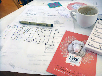
It's fun to look back at projects to see how they have evolved over time.
We don't often have the opportunity to cultivate a visual identity over the course of a few years: normally we work with commissioners for a few months to sort out their needs and then hand over the branding we've created for them. As the graphic designers for the TWIST fibre festival, however, we've been able to guide its evolution over the past 3 years.
This is what the TWIST logo looked like when we were brought aboard to audit their brand:
The intention behind the design was to create something that looked handcrafted and fun, as well as contemporary.
Their original designer had chosen a free font that only used repeating characters, and that repetition drew away from the handcrafted, authentic aesthetic that was being aimed for. Additionally, the typeface had a faux cross-hatched effect on it and there were some issues with the logoform's letter spacing.
One major problam with this version of the logo was that it was difficult to implement in different situations, and the tagline would disappear entirely if we tried to shrink it down to a usable size. We fixed that.
A strong brand guideline hadn't been established previously, so we cultivated one for them. We chose typefaces and colours, and defined their visual language.
This was last year's look:
We really wanted to emphasize the essence of handmade craft, so we drew a "Clarendon-esque" typeface by hand, imported it into Adobe Illustrator, and adjusted the letters by eye until the spacing was more optically balanced.
By creating a one-of-a-kind, truly hand-drawn typeface, one elevates brand equity because that typeface isn't one that can be downloaded on any font website.
TWIST has a different theme every year, and the visual identity can be refreshed accordingly in order to reflect each year's energy and aesthetic. This year has a particularly exciting energy because it's the festival's 5th anniversary, so our goal was to embody that by creating something vibrant and colourful; something that reflected the fact that this is a celebration of fibres and the myriad ways that people transform them.
As such, we went for a very hands-on approach: since I have been engaged in all manner of needlecraft since childhood, I went through my yarn stash and embroidered the logo by hand.
The letters were embroidered in a variety of different stitch styles so we could pick and choose among them to create the most dynamic effect. We went for bold, saturated hues this year both to evoke the aforementioned celebratory theme, and to promote the idea that this is a festival for all ages and genders to enjoy.
Our hope was that attendees and aficionados could be inspired by what we've done and make TWIST their own: whether they're knitters, weavers, lace-makers, or embroiderers, we've invited them to be more active participants in the festival by creating their own ...twist... on the TWIST logo.
...and Ava was a big help too.


No comments:
Post a Comment