Showing posts with label type. Show all posts

Wednesday, August 2, 2017

Farm the World Visual Identity

Farm the World is an endeavour geared towards teaching people how to grow their own food and medicinal plants in whatever space they have available to them, anywhere in the world. The site hosts articles about growing techniques, tips about heirloom and organic seeds, recipes, and herbal medicine-making tutorials, and offers products such as apparel, bags, and even art prints to help fund both the site, and its future seed box subscription program.

As the endeavour was inspired by both the Great Depression era and WWII "victory gardens", we created a visual identity drawn from rustic, vintage images and typefaces. The typography was actually based on rural signage, like the lettering found on milk crates and farm equipment.
 Colour inspiration was drawn from nature photos (a tomato held against the sky, leafy greens juxtaposed against compost-rich soil), with an overall aesthetic that speaks of wholesome self reliance and healthy foods.


For the botanical bags, we used vintage illustrations to evoke the imagery used on seed packets from the 1930s.


 There's also a series of bags, art prints, T-shirts, tanks, and hoodies that are solely typographic (on FTW colours), and use the typeface featured in the logo and website header.


All art prints and apparel are available via Farm the World's Society6 page.


FarmtheWorld.org


Monday, July 18, 2016

Case Study: TWIST Logo Redesign


It's fun to look back at projects to see how they have evolved over time.

We don't often have the opportunity to cultivate a visual identity over the course of a few years: normally we work with commissioners for a few months to sort out their needs and then hand over the branding we've created for them. As the graphic designers for the TWIST fibre festival, however, we've been able to guide its evolution over the past 3 years.

This is what the TWIST logo looked like when we were brought aboard to audit their brand:


The intention behind the design was to create something that looked handcrafted and fun, as well as contemporary.
Their original designer had chosen a free font that only used repeating characters, and that repetition drew away from the handcrafted, authentic aesthetic that was being aimed for. Additionally, the typeface had a faux cross-hatched effect on it and there were some issues with the logoform's letter spacing.

One major problam with this version of the logo was that it was difficult to implement in different situations, and the tagline would disappear entirely if we tried to shrink it down to a usable size. We fixed that.
A strong brand guideline hadn't been established previously, so we cultivated one for them. We chose typefaces and colours, and defined their visual language.

This was last year's look:


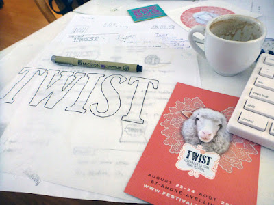
We really wanted to emphasize the essence of handmade craft, so we drew a "Clarendon-esque" typeface by hand, imported it into Adobe Illustrator, and adjusted the letters by eye until the spacing was more optically balanced.
By creating a one-of-a-kind, truly hand-drawn typeface, one elevates brand equity because that typeface isn't one that can be downloaded on any font website.
TWIST has a different theme every year, and the visual identity can be refreshed accordingly in order to reflect each year's energy and aesthetic. This year has a particularly exciting energy because it's the festival's 5th anniversary, so our goal was to embody that by creating something vibrant and colourful; something that reflected the fact that this is a celebration of fibres and the myriad ways that people transform them.

As such, we went for a very hands-on approach: since I have been engaged in all manner of needlecraft since childhood, I went through my yarn stash and embroidered the logo by hand.


The letters were embroidered in a variety of different stitch styles so we could pick and choose among them to create the most dynamic effect. We went for bold, saturated hues this year both to evoke the aforementioned celebratory theme, and to promote the idea that this is a festival for all ages and genders to enjoy.


Our hope was that attendees and aficionados could be inspired by what we've done and make TWIST their own: whether they're knitters, weavers, lace-makers, or embroiderers, we've invited them to be more active participants in the festival by creating their own ...twist... on the TWIST logo. 

...and Ava was a big help too.


Friday, July 3, 2015

Concord, Contrast, and Conflict... Oh my!


Years ago, I worked with a young designer who always matched the same handful of typefaces with each other, regardless of the project he was working on. Despite the fact that we had thousands of fonts at our disposal, he inevitably just used those 8-10 options, and got really edgy and defensive any time he was asked to change them. One day, I asked him outright why he always gravitated towards those specific choices, and he told me that one of his graphic design instructors had used them as examples of typefaces that could be mixed and matched, so those are the ones he used. I asked him if he knew why his instructor had recommended those pairings, and he shook his head—he didn't remember the hows and whys of those pairings, so he refused to budge from his comfort zone.

Mixing and matching typefaces is a subtle art, but ultimately, the goal is to create concord and contrast—not conflict. Some people aim for the tried-and-true method of pairing a serif with a sans serif, or a sans serif with a script, but those rules can create some pretty heinous combinations if you're just grabbing them at random.

A better approach is to determine what type of feeling you'd like the text to convey, and then assign fonts that serve specific purposes.

Concord

You can combine fonts within a type family in a variety of widths, styles, and weights that work well together because they were designed to work together.

With these low-contrast type combinations, you really can't go wrong with combining the different weights/widths, but each style within a family should be used for a specific purpose: You'd call attention with bold, but place emphasis with italic.

Bottom line: it's a means of differentiating areas of copy, as it changes the text colour.

If we were going to compare this to fine art principles, it's like working in a monochromatic palette; adjacent hues that work with one another.

Contrast 

The opposite of concord, you're creating contrast by using different type families. The basic rule in this regard is as follows:
If you have a serif, pair it with a sans serif.
If you have a sans serif, you can pair it with a script.
As long as you're pulling from notably different type families, and not combining two that are incredibly fussy and ornate, you're probably doing something right.

Good on you.

Fine art comparison: opposites on a colour wheel. These would be hues that complement one another because they contrast and/or vibrate.


Conflict

There are many different ways that font pairings can fall into disharmony and conflict, and you want to avoid them... like pairing two different scripts, two different serifs, or two different sans: the general rule here is NO.

One big hellstorm occurs when there isn't enough difference between the typefaces you've chosen. As an example, I recently came across a banner ad that combined Futura and Gill Sans, and my retinas started to foam. This pairing is a case of conflict; it combines a geometric sans serif with a humanist one, and although some people might argue that the friendly rounded-ness of Gill Sans complements Futura's sharp, geometric edges, I think this combination is absolutely appalling because they look too similar to create contrast, and they look too dissimilar to create concord.


NO! Bad puppy.

If you're dead set on using two sans serifs together, then consider using two different weights or widths from the same font family, like teaming Univers roman and bold, or Garamond regular and italic.

Pairing Futura with Gill Sans is the equivalent of serving spaghetti carbonara with a side order of fettuccine Alfredo. Seriously? Serve it with a f*cking salad.

*Note: One caveat with regard to pairing different styles from the same type family is that you need to ensure that there needs to be at least 20% difference in colour to create a noticeable visual contrast. As such, you wouldn't combine ultra-thin with thin, or bold with semi-bold, because well, they're almost twinsies. They should each be separate entities that can be differentiated at a glance.

What are some of your favourite pairings?

Friday, May 29, 2015

Swag for a Gothic Fashion Tea Party

Our lovely friend Taeden is the creatrix behind Gloomth and the Cult of Melancholy—a gothic fashion and lifestyle line based in Toronto, Ontario. Gloomth is holding their first-ever public tea party on June 13th, and we were invited to contribute an item to their coveted charity raffle prize pack.  (All proceeds from the raffle will benefit the Toronto Wildlife Centre.)


We donated a tote bag from our Sparrowling Press/Provincial Trading Company line of eclectic ephemera inspired by Victorian design and all things weird and wondrous. The Economical Mourning bag was beautifully described by Taeden as: "...the ideal tote for when you are out shopping for more embalming fluid". High praise indeed, thank you!


If you'll be in the Toronto area on June 13th and have a fondness for all things Lollygoth, stop by the Flying Pony Cafe at 1481 Gerrard St. East between 6:30 and 10:30 pm. Admission is free, and there will be a gothy dress code enforced, so no jeans or Birkenstocks!