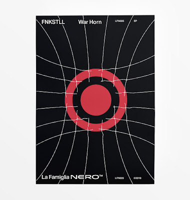
For the album cover, I started my visual explorations on paper, since I can thumbnail ideas quickly before taking them into Illustrator. I wanted to visually convey the power of a war horn's blast, and after some doodles, I liked how the expanding concentric circles were looking. However, I was feeling it was a bit cliche once I started recreating the designs in the computer.
If I'm ever stuck, I find a solution for creating unique designs is to ask, "How can I communicate this concept differently?" By rattling and opening new doors, you'll be surprised at some of the novel solutions you may discover on the other side.
One option I explored had radiating lines emanating from a central red disc—a simplification of the the front of the horn. The lines imparted a sort of tribal feeling and I like the optical shimmer effect that happened as the thickness tapered towards the center of the composition.
Pushing the idea further, I created a sense of depth and weight as the round red pulse struggled to break free from a radar grid of thin lines. I like the contrast between weights and colours, and how the net bled off the page breaking the borders.


No comments:
Post a Comment