Showing posts with label Modernist design. Show all posts

Thursday, February 14, 2019

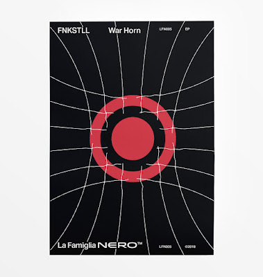
War Horn—album cover design process


Album cover designs always seem easier to execute in one's head—when it comes to practise however, things aren't so simple. Here's a quick peek at design work done recently for War Horn by FNKSTLL, an upcoming release through the techno label, La Famiglia Nero.


The visual language that defines La Famiglia Nero's identity tends to stray on the side of Modernism, with carefully considered placement, sans serif typefaces and an underlying grid structure to unify the various releases. Previous designs have explored flat, geometric compositions using an economy of means and exercising restraint in execution.

For the album cover, I started my visual explorations on paper, since I can thumbnail ideas quickly before taking them into Illustrator. I wanted to visually convey the power of a war horn's blast, and after some doodles, I liked how the expanding concentric circles were looking. However, I was feeling it was a bit cliche once I started recreating the designs in the computer.


If I'm ever stuck, I find a solution for creating unique designs is to ask, "How can I communicate this concept differently?" By rattling and opening new doors, you'll be surprised at some of the novel solutions you may discover on the other side.


One option I explored had radiating lines emanating from a central red disc—a simplification of the the front of the horn. The lines imparted a sort of tribal feeling and I like the optical shimmer effect that happened as the thickness tapered towards the center of the composition.


Pushing the idea further, I created a sense of depth and weight as the round red pulse struggled to break free from a radar grid of thin lines. I like the contrast between weights and colours, and how the net bled off the page breaking the borders.


Here's a peek at the final render of the "War Horn" album cover which comes out later this month, as well as how I adapted the designs for the poster and banners. The tracks on the EP are a body-moving exercise in murky, paired down techno which hopefully the designs do justice!


Wednesday, January 23, 2019

Clear and Present Thinking — 2nd Edition


We re-hauled the editorial designs and interior layout for the second edition of Clear and Present Thinking, the popular, college-level textbook in logic and critical thinking.

Here's a few sneak peeks at a few of the spreads!


Clear and Present Thinking, 2nd Edition, is available as a PDF for free, or purchased through Amazon. Visit Brendan Myer's site for more info:

http://www.brendanmyers.net/nwpbooks/cpt.html

Thursday, December 1, 2016

Tuesday, February 9, 2016

New Year, New Look


Since 2016 marks Winter-Hébert's 5th anniversary, the time is right for us to update our visual identity. After much brainstorming and sketching and fussing and such, we decided to go with simple forms and basic hues, inspired by the birds that helped to spark our studio's very existence.


Many people are unaware of the fact that our studio came into being thanks to a couple of house sparrows. Back in 2011, we were both working with various studios in the Toronto area when we found a tiny, newly hatched baby bird squirming on the hot sidewalk outside a store. Being the animal lovers that we are, we promptly scooped him up and took him home, hoping that we could somehow keep this little weirdo alive. His need for around-the-clock feedings prompted us to start working remotely with commissioners from around the world, and that leap was reaffirmed by our finding a female hatchling not long afterwards. 

We named them Robin and Puck*, and they turned out to be a couple of house sparrows (Passer domesticus). Robin had been tossed from his nest because of physical deformities, while Puck was the only survivor of a nest destruction by a nasty neighbour. Since neither of them would have survived out in the wild, they've become our constant companions and travelled with us from Toronto to our current place in rural Quebec.
These two little birds weren’t just the catalysts for us establishing our own design studiothey reflect the duality of how we approach our work as a whole. Just like our sparrows live (and play) together, with their unique personalities contrasting and complementing one another’s, so do we tread the magical middle zone between rationally driven design and intuitive solutions. 


For the revamp, we chose a simple white and blue palette, with an elegant sans serif typeface and simplified lines. The white represents Winter (as well as my Scandinavian ancestry), and the classic French blue pays homage to Nathaniel's French-Canadian lineage (the Héberts have been living in Quebec for over 400 years).

We think that this new look encompasses our fondness for sleek, modernist design, as well as our passion for authenticity and handmade craft. Our work is heavily influenced by Dutch and Swiss work, but we will hand-draw unique typefaces if the occasion calls for it, and we’ve incorporated elements such as watercolour painting, embroidery, and even wood burning into projects. 


We think that our new look says a great deal about who we are, and we hope you like it as much as we do.

Puck and Robin in all their adorable glory.

*Sparrows' plumage becomes identifiably male or female after their first moult, so we chose gender neutral names for our feathered kids so they'd fit well regardless of whether they turned out to be male or female.
Also, just for the record, their names were chosen from Shakespeare's Midsummer Night's Dream, not hockey. 


Friday, June 12, 2015

Inspiration: Spotlight on Josef Müller-Brockmann.

Every artist or designer has a list of people who have influenced their work, and we're no exceptions to that.

We glean inspiration from all manner of sources, but in terms of form and "crispness" in our work, as well as the approach we take to concept-driven design, one of our strongest influences is Josef Müller-Brockmann. Considered to be one of the key innovators in the Swiss School of International Style, he helped to establish a new era of clean, minimalist design aesthetics that were a total contrast to the heavily ornamented, subjective designs of the late 1800s/early 1900s. 

If you've studied graphic design or typography, you're undoubtedly familiar with some of Müller-Brockmann's posters, in particular those that he did for concerts that took place around Switzerland:


These posters display a geometric, mathematical harmony that's meant to reflect the rhythms and harmony present in music itself. Likely influenced by the graphic style of Bauhaus poster design, these are a far cry from heavily illustrative pieces—they're pared down to their most essential elements, but still draw the eye and evoke a cerebral response from the viewer.
“The belief that graphic design—if it was to inform and enlighten without being manipulative— had to be based on objective criteria,” is what led JMB to his turning point."
His more angular pieces even evoke the sharp lines and bright hues of the De Stijl movement (think Piet Mondrian and Vilmos Huszar), and he used typography as a key design element instead of relegating it to just convey written information.


In stark contrast to the over-decorative frippery of the earlier 1900s, his pieces were minimalist, and utilised the key elements of visual design, including hierarchy, balance, unity, gestalt, contrast, and repetition. His use of typography was crisp and efficient, he leaned towards 3- or 4-column layout, and often used typefaces from the Akzidenz Grotesk family.

His work embodied functionality, objectivism, concrete art, legible typography, and adherence to the concept or theme of a project, rather than enforcing a personal style that could be easily recognised. He was a huge proponent of using grids and geometry in his work, and even wrote a book entitled Grid Systems in Graphic Design, about his approach to/execution of various projects. One small excerpt from that book expresses a great deal about how we approach design, whether it's a logo or an entire visual identity system:
This is the expression of a professional ethos: the designer’s work should have the clearly intelligible, objective, functional and aesthetic quality of mathematical thinking.
His work should thus be a contribution to general culture and itself form part of it.

Working with the grid system means submitting to laws of universal validity. The use of the grid system implies:
The will to systemize, to clarify
The will to penetrate to the essentials; to concentrate the will to cultivate objectivity instead of subjectivity
The will to rationalize the creative and technical production processes
The will to integrate elements of colour, form, and material
The will to achieve architectural dominion over surface and space
The will to adopt a positive, forward-looking attitude
The recognition of the importance of education, and the effect of work devised in a constructive and creative spirit.
Every visual creative work is a manifestation of the character of the designer. It is a reflection of his knowledge, his ability, and his mentality.
Although we draw a great deal of inspiration from Müller-Brockmann's work, it's his emphasis on drawing from the brief and placing all focus on making the project shine, rather than creating something based on his own whims and fancies, that inspires us the most.


Advert poster for a Swiss car club, with a strong warning to watch out for/protect children.


Müller-Brockmann was able to say more in his restraint than many designers can express in all of their subjective doodles combined. Simplicity of form, elegance, and a noted lack of ornamentation resulted in pieces that spoke softly, but with a strong, powerful voice.