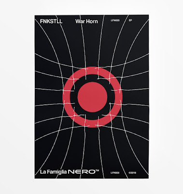
In the past, design was flavored by geographical isolation. Aesthetics were informed by the characteristics of the landscapes that people saw on a daily basis, whether sharp mountain peaks, or soft, rolling foothills. Hues from the landscape informed designers' palettes, and all of these factors made it easy to discern design that originated in Germany versus England. With the birth of the International Typographic Style in the 1960s, such clear delineations ended up muddled: influences were taken from around the globe, rather than being cultivated in a bubble.
A question that came to mind recently was this: in these modern, connected times, with endless scroll feeds informing an international aesthetic, what role does local culture play in a design practice?
We live in an isolated forest community in rural Quebec, tethered to the world at large thanks to the miracle of the Internet. As part of our creative process, we study our surroundings, drawing colour swatches and composition ideas from nature. It’s interesting to note that everything we see around us exists because their ancestors were successful when it came to adaptation and reproduction.
Flowers in particular have adapted over countless generations: the colours that we see are the most fit;, the tested and true that have found equilibrium after eons of attracting and dancing with pollinators.
The colour combinations and scintillating contrasts that exist naturally are there for the taking, so we have begun to use them, with reverence. In fact, we have recently undertaken some constraints in our personal design practice: within our process, we are only allowed to drawn upon the palettes that we've "unlocked" locally.
There is something rewarding about having to physically traipse through the forest on a colour safari, hoping to stumble across some new bit of fauna that will expand our palette. Factors such as the time of day and the camera we're using end up playing a role with regard to the hues being documented as well. Our intention is to represent truth in as objective a manner as possible, and reflect nature's sage counsel when it comes to colours.
In this manner, our work becomes informed by the local environment, with inspiration pipelined and swatched direct from Mother Nature herself. In some manners, we're plagiarizing her greatest works ruthlessly, but the act of being an imperfect conduit for her inspiration becomes an act of creativity: the noise on the line.
When shared back to the connected design community, our work can't help but reflect the environment we're living in, with colours and shapes native to the ancient forest that surrounds us.
You don't have to hightail it to the desert like a nomad to get inspiration (though thinking about it, doing so sure sounds pretty). Your neighbourhood's architecture and charm are real expressions of humans bringing order and joy to their environment. That impulse right there is pretty much the definition of design, so if you take what you observe around you and reflect it into your work, you can achieve that objective posture that so many Modernists sought: moving the ego aside, you can submit to the universe and become a perfect conduit to natural Order and Truth.