Showing posts with label Twist. Show all posts

Wednesday, August 31, 2016

TWIST 2016 - 5th Anniversary!


This year marked the 5th anniversary of the TWIST festival, and it was a blast to be part of the team that helped to bring it to life! The identity we created for this year's event was the brightest and most exciting yet, so if you weren't able to attend in person, scroll through festival's photos below to see what you missed!


Monday, July 18, 2016

Case Study: TWIST Logo Redesign


It's fun to look back at projects to see how they have evolved over time.

We don't often have the opportunity to cultivate a visual identity over the course of a few years: normally we work with commissioners for a few months to sort out their needs and then hand over the branding we've created for them. As the graphic designers for the TWIST fibre festival, however, we've been able to guide its evolution over the past 3 years.

This is what the TWIST logo looked like when we were brought aboard to audit their brand:


The intention behind the design was to create something that looked handcrafted and fun, as well as contemporary.
Their original designer had chosen a free font that only used repeating characters, and that repetition drew away from the handcrafted, authentic aesthetic that was being aimed for. Additionally, the typeface had a faux cross-hatched effect on it and there were some issues with the logoform's letter spacing.

One major problam with this version of the logo was that it was difficult to implement in different situations, and the tagline would disappear entirely if we tried to shrink it down to a usable size. We fixed that.
A strong brand guideline hadn't been established previously, so we cultivated one for them. We chose typefaces and colours, and defined their visual language.

This was last year's look:


We really wanted to emphasize the essence of handmade craft, so we drew a "Clarendon-esque" typeface by hand, imported it into Adobe Illustrator, and adjusted the letters by eye until the spacing was more optically balanced.
By creating a one-of-a-kind, truly hand-drawn typeface, one elevates brand equity because that typeface isn't one that can be downloaded on any font website.
TWIST has a different theme every year, and the visual identity can be refreshed accordingly in order to reflect each year's energy and aesthetic. This year has a particularly exciting energy because it's the festival's 5th anniversary, so our goal was to embody that by creating something vibrant and colourful; something that reflected the fact that this is a celebration of fibres and the myriad ways that people transform them.

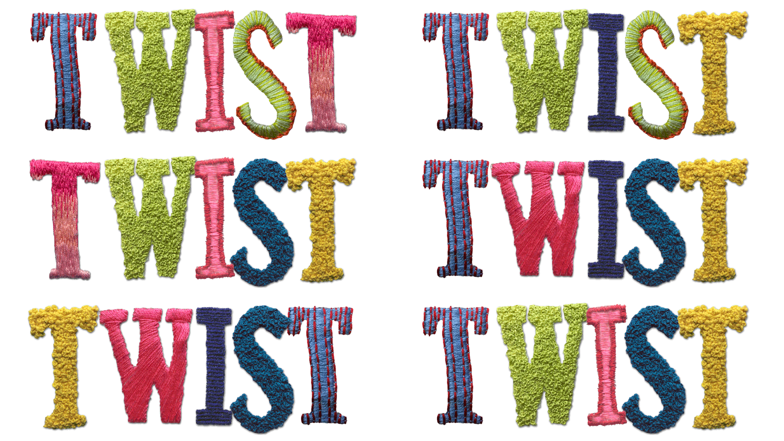
As such, we went for a very hands-on approach: since I have been engaged in all manner of needlecraft since childhood, I went through my yarn stash and embroidered the logo by hand.


The letters were embroidered in a variety of different stitch styles so we could pick and choose among them to create the most dynamic effect. We went for bold, saturated hues this year both to evoke the aforementioned celebratory theme, and to promote the idea that this is a festival for all ages and genders to enjoy.


Our hope was that attendees and aficionados could be inspired by what we've done and make TWIST their own: whether they're knitters, weavers, lace-makers, or embroiderers, we've invited them to be more active participants in the festival by creating their own ...twist... on the TWIST logo. 

...and Ava was a big help too.


Friday, March 4, 2016

TWIST - of Textiles and Type


As graphic designers, most of our days are spent sitting at our desks, working in various Adobe programs. Although that's a hell of a lot of fun, it's nice to be able to step away from that creative medium once in a while and use more traditional techniques instead. Sure, we'll use hand-drawn or painted assets in our work fairly often, but for the visual identity for this year's TWIST Fibre Festival, we went in a new direction and hand-embroidered the logo to really evoke the sense of handmade craft and fibre arts.


(When I say "we", I mean that I hand-embroidered letters, which were then used to spell out "TWIST". We have some shared skill sets, but needlework doesn't really fall under Nathaniel's purview.)


I used several different stitch techniquesfrom cross-stitch and petitpoint to couching and crewel, embroidered on both canvas and burlap with a variety of different fibresso we had a wide range of hues and textures to choose from. Ultimately, we chose a mixture of embroidery thread for the letterforms, and assorted handspun artisanal yarns for the colourful accents.


It's funny... we can create faux versions of just about any texture imaginable with Photoshop and Illustrator, but there's nothing quite like creating the real thing by hand.
We're huge fans of authenticity, and since we're designing these pieces to promote a fibre festival (which draws knitters, spinners, and other fibre fiends from around the world), it was a lot of fun to work with needle and thread instead of just a mouse and a drawing tablet.


I've been doing needlework since I was a child, but had never had the opportunity to put it to use in a practical design application before, so this was a fabulous new experience in Winter-Hébert land. It was also nice to spend several chilly evenings curled up by the fire and stitching merrily whilst binge-watching British murder mysteries on Netflix and Acorn.

Here's hoping that we'll see you at the TWIST festival in Saint-André-Avellin this August!


Saturday, August 29, 2015

TWIST Festival: Design in Action

In our last post, we showed you the visual identity we created for the TWIST fibre festival: a two-day expo of all things related to fibre arts like spinning, knitting, crocheting, weaving, and more.

Well, the festival was last weekend, and we had the opportunity to check it out in person! Since we work with clients from around the world, it isn't often that we get that kind of chance, so it was lovely to see our wayfinding signs for the festival as we meandered around, checking out different vendors and buying plenty of yarn to play with.

...okay I bought yarn to knit with and Nathaniel indulged my whims because I've promised him handmade socks.

On to the TWIST designs in action!


First and foremost, a series of newspaper adverts we created, which were circulated across Quebec and Ontario.


En route to the festival, merry little sheep branded with the TWIST logo pointed the way.


The sweet-faced lamb graced the entryway!


It was great to see our signs come to life on the venue's walls. They look so different when blown up to several feet in size, as opposed to just displayed on our Mac screens.


Signs and schedules were displayed around the demo area and children's workshop.


Cones and skeins of yarn in every colour and fibre imaginable were on display all around the festival...


...and of course, I had the opportunity to paw through some stunning mini-skeins of yarn made by Studio Loo—one of the vendors there.

More photos can be seen on our Behance page, so feel free to head on over there to check them out.

Happy weekending!
xo
C

Monday, July 27, 2015

A fibre festival with a... TWIST.

The nearby village of Saint-André-Avellin is home to the TWIST fibre festival: an annual two-day event that encompasses all that is wild and wondrous about fibre arts. Artisans and suppliers from around the world take part in this fest, where aficionados can indulge in tactile bliss and take classes or workshops to learn new skills.

We're delighted to design the visual identity for TWIST this year, so here's a peek at what we've created:


We wanted to put a new ...er.... "twist" on this year's designs while ensuring that the core, established identity was still recognizable. This called for several cups of espresso and many hours spent sketching out new ideas with pen and paper.


We refreshed the TWIST logo, using a hand-drawn, rustic Clarendon-esque approach instead of the faux-sketch of the previous version. It's complemented by line drawings of yarn balls and fibre-crafting tools, which also mirror the line-work of the lace collar that frames the main sheep's head.


Colour-wise, we went for fresh, bright hues in blue, green, and chartreuse, inspired by the hand-spun and blended yarns created by TWIST's founder, Amélie Blanchard of La chèvre d'oeuvre.


TWIST's typefaces:


And TWIST's... types of faces:


Sheep and rams and alpacas and goats and angora bunnies and and and...


It really is a spectacular festival, so if you like to fondle fleeces or transform roving and yarn into vibrant, daring items, don't miss it!

TWIST Fibre Festival
August 22-23, 2015
530 Rue Charles Auguste Montreuil
Saint-André-Avellin, Quebec
http://www.festivaltwist.org/en/home/